


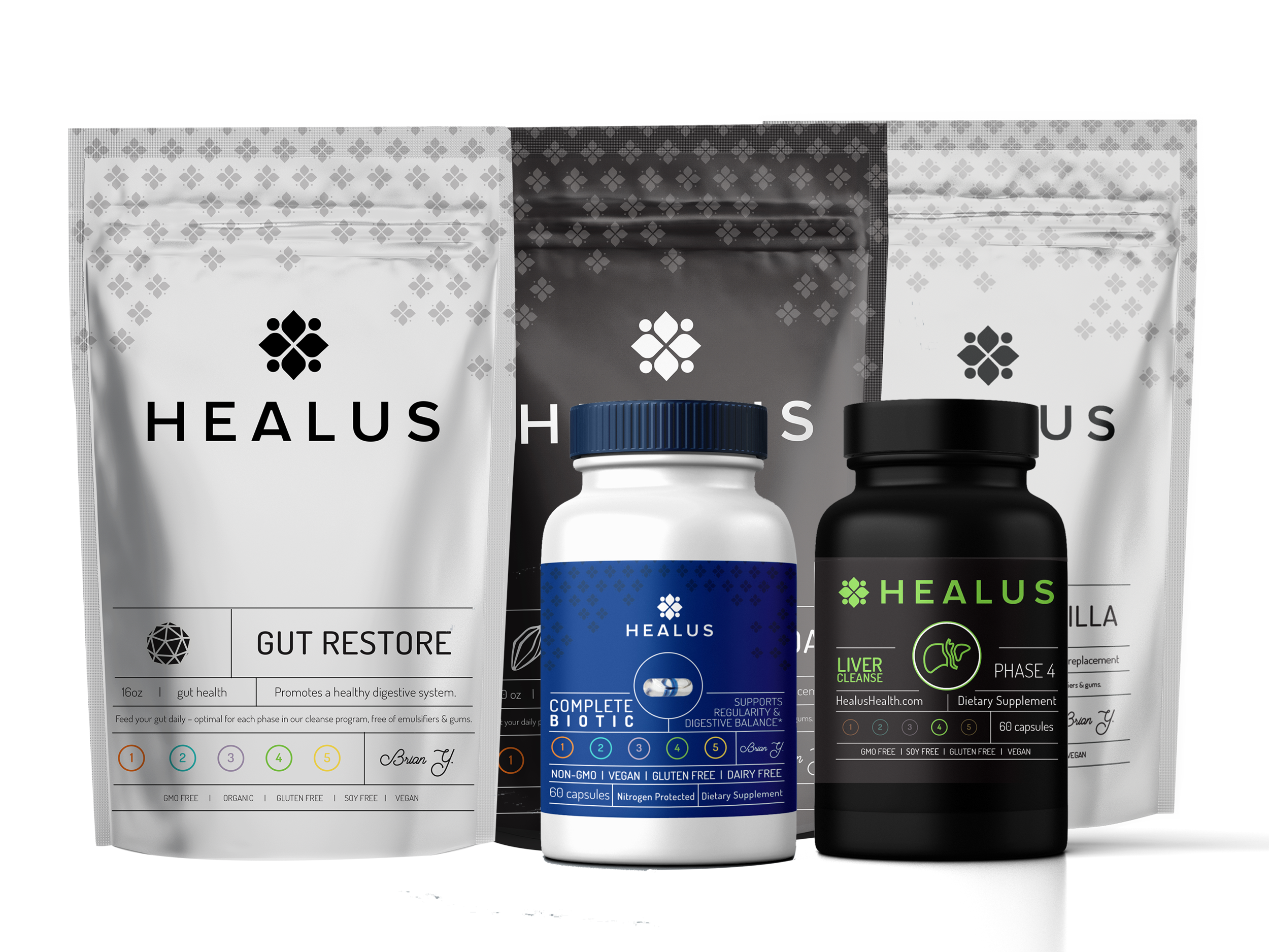


An effort that included the incredible design team at Elevate, this was a true design chain of director to designer. I created the logo and drew up a basic ideation of the product packaging which was then fully realized by one of my designers, Adam Long.
Most health industry companies go for white bottles, which don’t stand out on any store shelf. The concept was: each phase gets paired with a specific color. This felt like a strong juxtaposition to a black bottle which is rarely seen in the health/cleanse space. I drew each phase icon and designed the website which was built out by their internal web UI/UX team.* My Elevate team created various assets including packaging, social media graphics, and landing page design, and web page design.
We worked around specific timelines I would establish with the client and we continually delivered projects on time. This product launch was a total rebrand of their company which was previously Sarasota Health Institute.
*Since working with them, the website has shifted to something more simple as they refocus their product line.