


Though the initial branding was completed by Moxie, once Shawn and Andrew East moved into more of a front-facing role, they wanted the branding to reflect their personality. Previously, the color palette Moxie had created was charcoal, dark blue, taupe, and white. They felt it was lacking in personality and felt a little too streamlined for their audience.
I did an entire overhaul of the brand foundation, apart from the logo work. This included new typography, new color scheme, and the front and back label rediscovery and design.
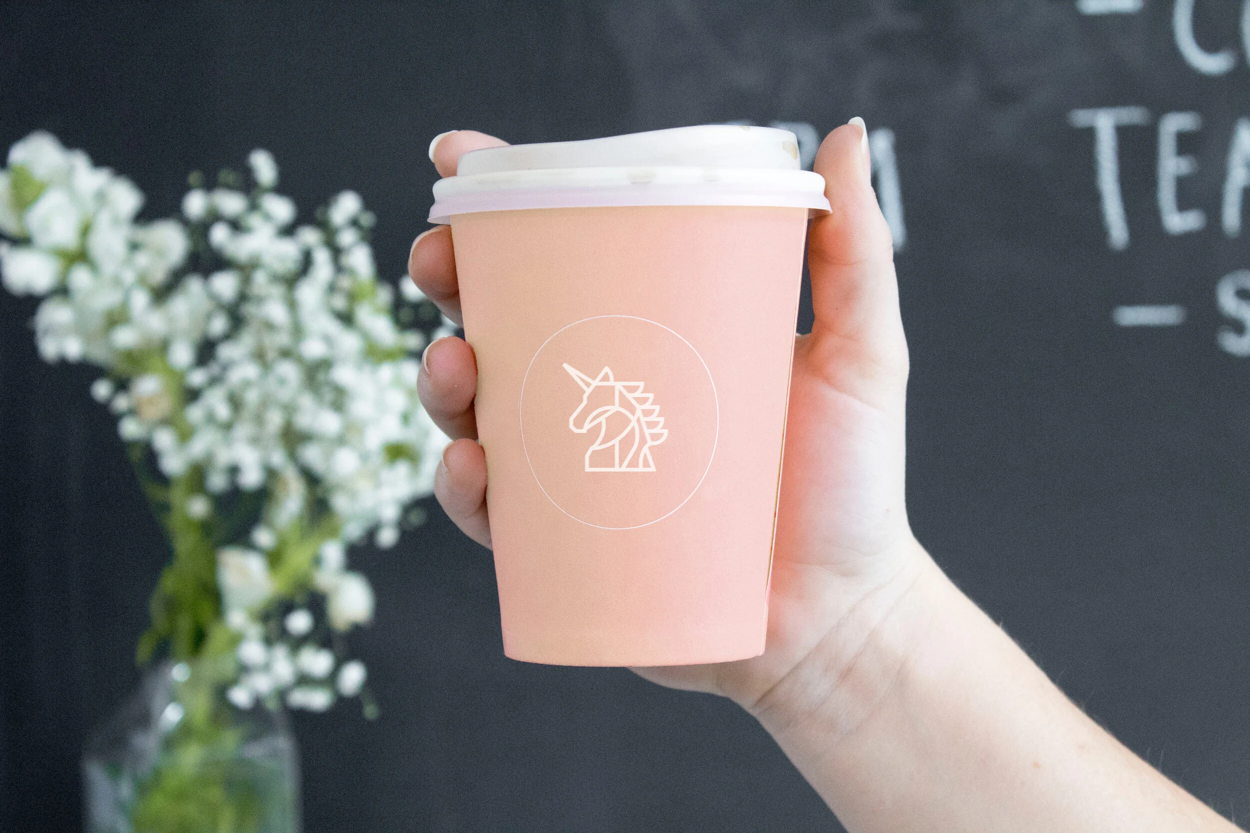
Shawn really loved the concept of something on the funkier side which is why I designed the upscale ric-rac border as well as the stamp action and mixed playful typography including all-caps subheader text and a hand-written alternative logotype.
Also included in this case study was sticker design, box design, production communication, postcard design, and various social media asset creation. I also created a custom Madison’s Reserve Honey x Uniqorn Coffee label exclusively for the launch.